Checkbox
Through a checkbox a user can select a binary value (ex. true/ false). When the user clicks the checkbox, it changes between checked and unchecked. A checked checkbox implies that the state described by the checkbox text applies, or that the item has been selected.
Properties
- The checkbox label is aligned to the right of the box.
- Users should be able to select the checkbox by clicking on the box directly or by clicking on its label.
Example

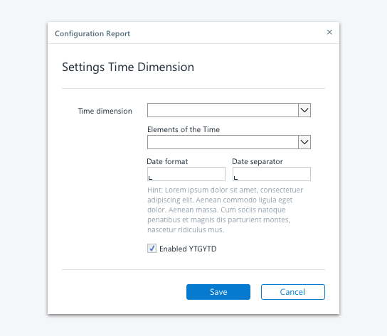
Checkbox embedded in a dialog
Checkboxes allow the user to select one or more items from a set or to turn an option on or off. Here are some tips for you when using checkboxes:
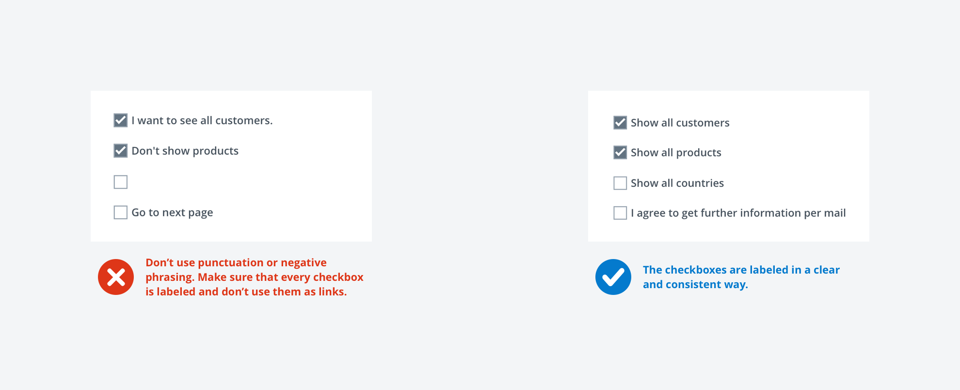
Label every checkbox clearly
Don’t let your user guess what is going to happen when he/she interacts with the checkbox. Write the label as a phrase or an imperative sentence, and use no ending punctuation.
Be consistent with the labeling
For a group of check boxes, use parallel phrasing and try to keep the length about the same for all labels.
Use positive phrasing
Avoid negation to make your wording better understandable.
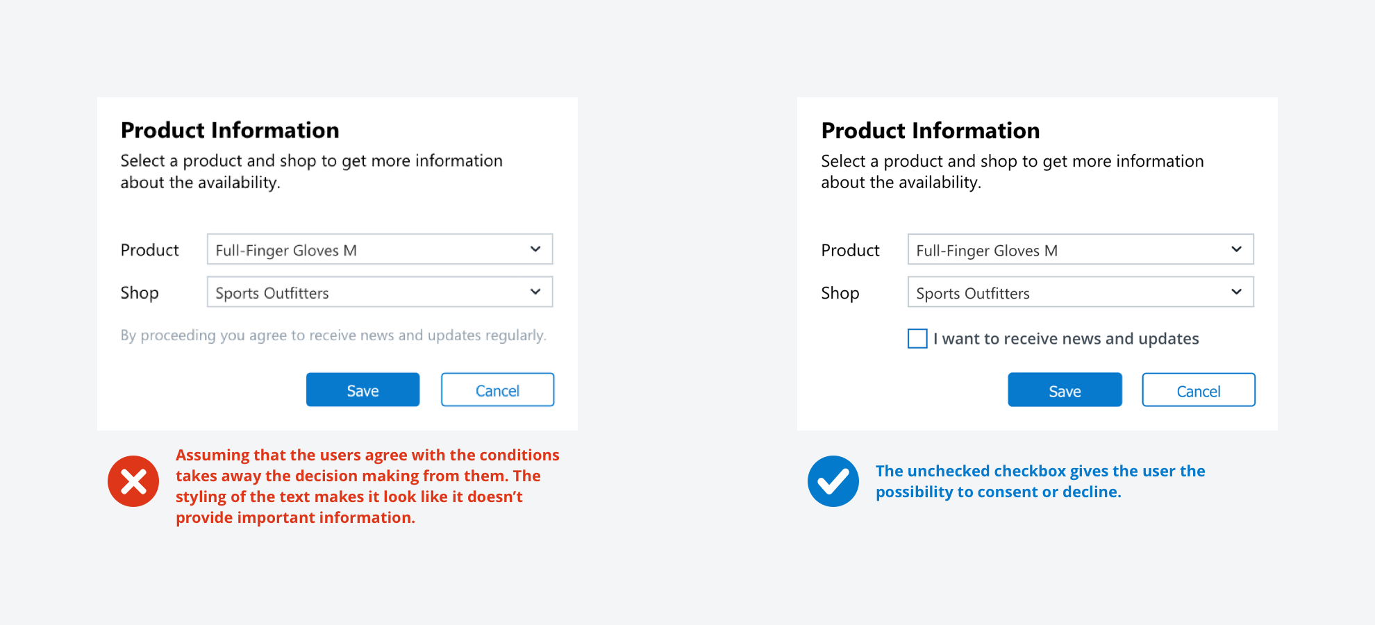
Avoid checked checkboxes by default
If you use a checkbox for opt-in purposes, don’t use prechecked checkboxes. If your user oversees this option, you take away the decision from him/her.
Keep the context in mind
Don't use checkboxes to perform commands or opening new windows like dialog boxes.

Opt-in / Opt-out
This functionality is the process of actively agreeing or disagreeing to certain conditions or offers. Opt-in and Opt-out choices are an important part of the UX, but it got kind of a shady reputation because it often seems like they are often designed to serve the company but confuse the user. So let’s take a look at how to create user friendly opt-in and opt-out choices:
Tell your user why there is an opt-in
Make it clear to your user what he/she is agreeing to. Communicate what the advantages are to opt-in and make the conditions clear.
No automatically checked checkboxes to force an opt-in
This is a dark pattern you can see sometimes. The thought behind it is that the user doesn’t read everything word by word and “accidentally“ agrees to certain terms. Trying to fool your users always leads to a bad UX and will harm the reputation of your company.
Don’t force people to opt-out
Make your users actively agree to conditions instead of assuming they are fine with it. If users don’t agree, they now have to look for an option to opt-out and it changes the process from being a decision to being a task.
Aim for transparency
Often users can opt-out in the settings, e.g., cancel a subscription, deleting an account. Don’t hide those information and expect people to give up looking for it. Instead, this will have a very negative impression on your user.
