Quick Start Guide
The Quick Start to design your report efficiently and effectively. The step-by-step approach based on the Jedox Design System guides you through the design process for your reports.
- Define Requirements and Goal
- Define your Layout
- Define your Colors
- Define your Typography
- Start building in Jedox
Step 1: Requirements and Goal
You know your users and you considered carefully which info you want to present in your report, but now you are struggling with presenting it in a clear and professional way? The following tips will help you out.
Focus on essential info.
Don’t try to make your report look more important by adding info the user doesn’t need. Adding unimportant content will make your report confusing.
bold Group elements logically.
Placing related elements close to each other is very important for your users to understand the structure of your report. If you have some kind of navigation for example, place all element that belong to this type close together.
bold Make your report accessible.
Don’t hide important information from your users and make interactions as easy as possible.
bold Plan interconnections between different reports.
If you design interconnected reports, make the navigation as simple as possible. Provide information about the current location of the user and how to navigate to different sections.
Example for different layouts for different contents:

Step 2: Layout
Your report in Jedox allows different layout options which serve different purposes.
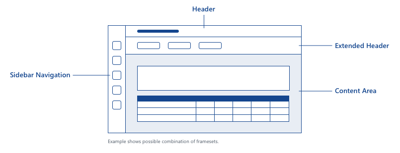
- The header contains the title of the report, horizontal navigation elements and various buttons (menu, back to, filter, logout etc).
- The extended header area can comprise filter options (PoV), navigation and further content e.g. data visualization widgets.
- The content area can comprise tables, panels, charts, graphs, dialogs or forms and other UI elements.
- The sidebar navigation with its menu serves the purpose of navigation and orientation on the Jedox platform.
- Framsets make it possible to display multiple files in a single window.
Example for the layout of a report:

Step 3: Colors
Colors are a very powerful part of your design. When creating a color palette, keep the following tips in mind:
Every color has its purpose.
Define only the colors you need. Consider which color you want to use in which context.
Define a simple palette.
Use only a small set of colors in your reports. A rule of thumb is not using more than 3 colors in your design.
Define base and highlight colors.
Use font colors with a high contrast to the background colors. Define a color to highlight important elements in your layout.
Use colors from the Corporate Identity.
Colors from the Corporate Identity of your company or of your customers are a great base to create a color palette.
Make your colors accessible.
Keep in mind that not everyone is able to perceive some colors. You can use multiple online tools like Adobe Color, Colorbrewer or Coolors.
If you need more help, check out this section in the Design System: Colors
Example of Color Schemes for your report:


Step 4: Typography
Define the typography of your report and use it consistently throughout the model! If you're formatting text in cells and you could even rely on a stylesheet with predefined styles. Keep the following tips in mind when you are defining the typography for your report:
Choose a font family that is easy to read.
Text that is not readable is very frustrating to the user.
Define different font sizes for different types of text.
Make the difference between the sizes quite large to make the different types of text easy to distinguish.
Use a small set of text styles.
Don’t use too many variations of different font families, sizes, colors and weights. This will make your layout look cluttered and hard to scan.
Be aware of the font availability.
If somebody wants to open your report and has not installed the font family that you used, it will be replaced with an available font. This can have a huge impact on your design.
If you want more information about typography, you can find it here in the Design System: Typography
Examples of defining the typography for your report:

Step 5: Build your reports in Jedox!
Get your hands dirty and assemble your reports out of the different modules that we describe in our Design System - from header and extended header to tables and data visualizations or even modules you create on your own. Pro tip - Gather your defined styles in a resource sheet you can easily access, so you can look up quickly those defined styles.

Have fun!
- Previous
Design Principles -
Next
Colors