Tooltips
Tooltips are brief, informative messages, that are activated if a user interacts with a certain UI element, usually by a hover gesture. Here are some tips to make your tooltips more useful:
Properties
Show additional info
Tooltips are not meant to provide crucial information. If you want to communicate something, that is very important for the user to proceed interacting, this should be displayed in a more obvious way.
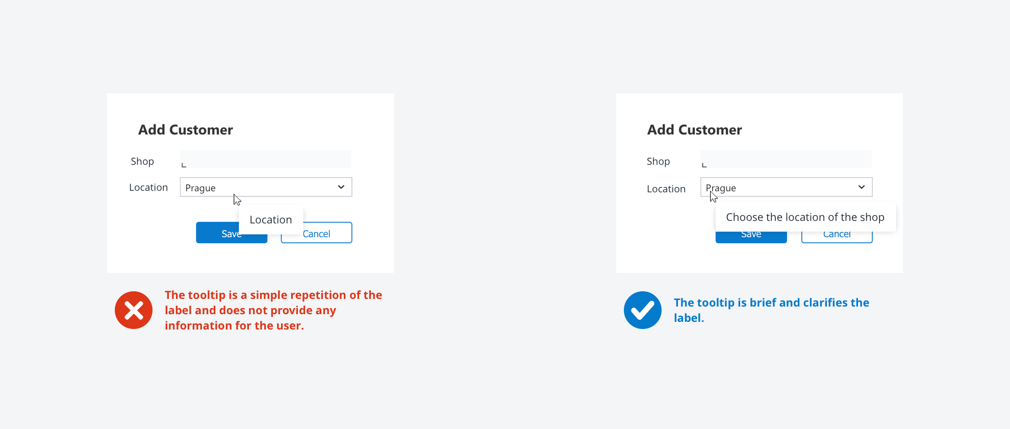
The content has to be brief and helpful
Avoid redundant content, e.g., when adding a tooltip to a button, don’t simply repeat the label of it. If you can’t think of additional information, that is useful for your user, you don’t have to add a tooltip. Furthermore, keep it short and simple. Tooltips are microcontent and shouldn’t block related content.
Use tooltips consistently
If you are using tooltips, there is no visual indicator for your user to discover them. That’s why you have to use them consistently way to meet user expectations. E.g., if you are adding a tooltip to multiple buttons, users will be confused if one button does not have additional information.

-
Previous
Text Input -
Next
Analytical Panel