Links
Links are clickable objects that can guide a user to an other location like a file or website.
Links are one of the most commonly used UI elements. It is a straightforward way to navigate between web pages or files. Links are very helpful to add further content without overwhelming your users with too much information.
When to use
- if you want to provide further information to your user.
When not to use
- If you don't intend to guide a user to another location.
Formatting
Label the link clearly
Make it obvious to your user what is going to happen if he/she clicks the link.
Make it look clickable
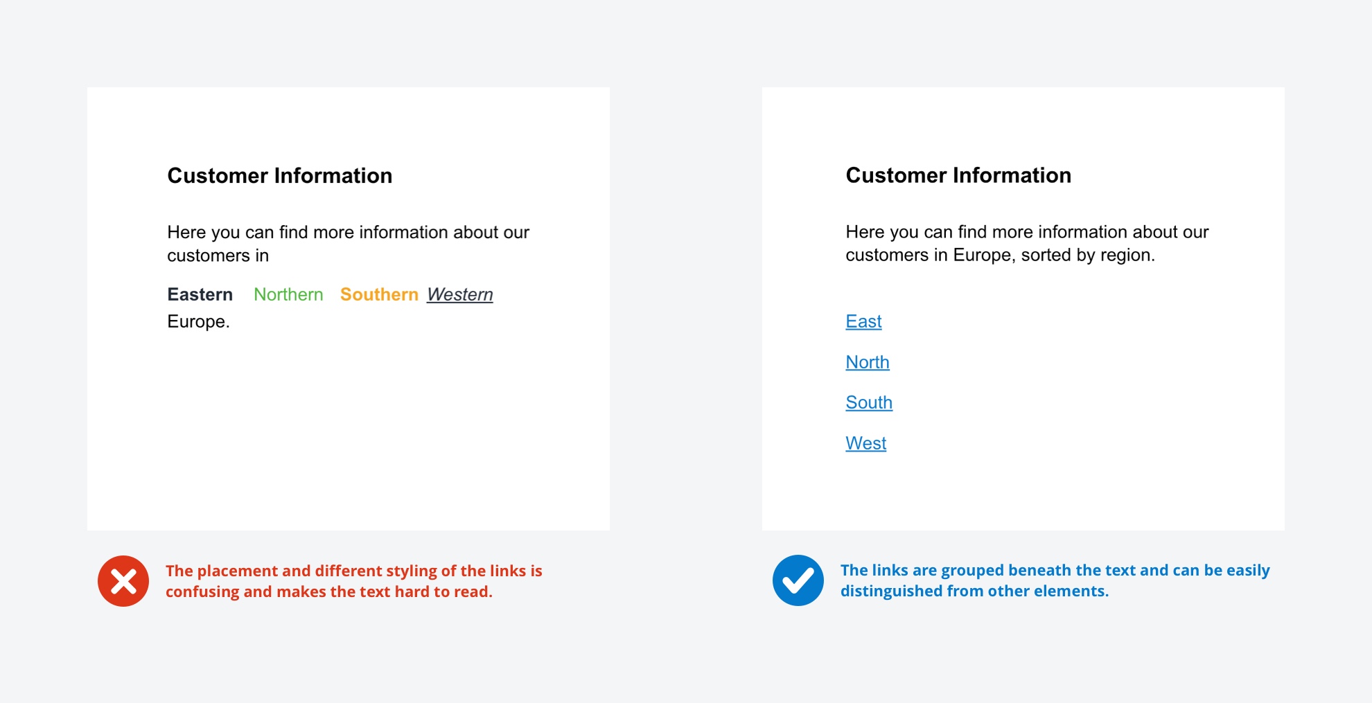
Highlight your links by giving them a different look than the rest of your text. For example, you can use a different color and/or underline it. We recommend using our primary blue as the predefined color for links (text links should be underlined). If you use a dark background color, please use a contrary color as icon or text color.
Give your links a consistent look
If you defined a style for your links, don't try to change things up! You have one link that is colored blue, an orange one, in bold and italic … ? This will confuse your users and make your links hard to identify.

