Menu
Typography
For us, good typography is invisible – as we design to reduce the friction between people and their tools and to ultimately help them to achieve their goals. To accomplish this we've chosen a full font stack with fonts that display well, both as numbers and letters, in all sizes.
Calibri

Headline Large 15pt (22px)
Headline Middle 13pt (18px)
Headline Small 12pt (16px)
Text, Button 10pt (13px)
Caption 8pt (11px)
Arial

Headline Large 15pt (21px)
Headline Middle 13pt (17px)
Headline Small 12pt (15px)
Text, Button 10pt (13px)
Caption 8pt (11px)
Segoe UI

Headline Large 14pt (21px)
Headline Middle 12pt (17px)
Headline Small 11pt (15px)
Text, Button 9pt (13px)
Caption 8pt (11px)
Open Sans

Headline Large 14pt (21px)
Headline Middle 12pt (17px)
Headline Small 11pt (15px)
Text, Button 9pt (13px)
Caption 8pt (11px)
The use of the fonts Open Sans and Segoe UI requires the installation on both host and client computer. If this is not the case it will fall back to the fonts installed on the system. Here you can download Open Sans for free.
Easy to read text
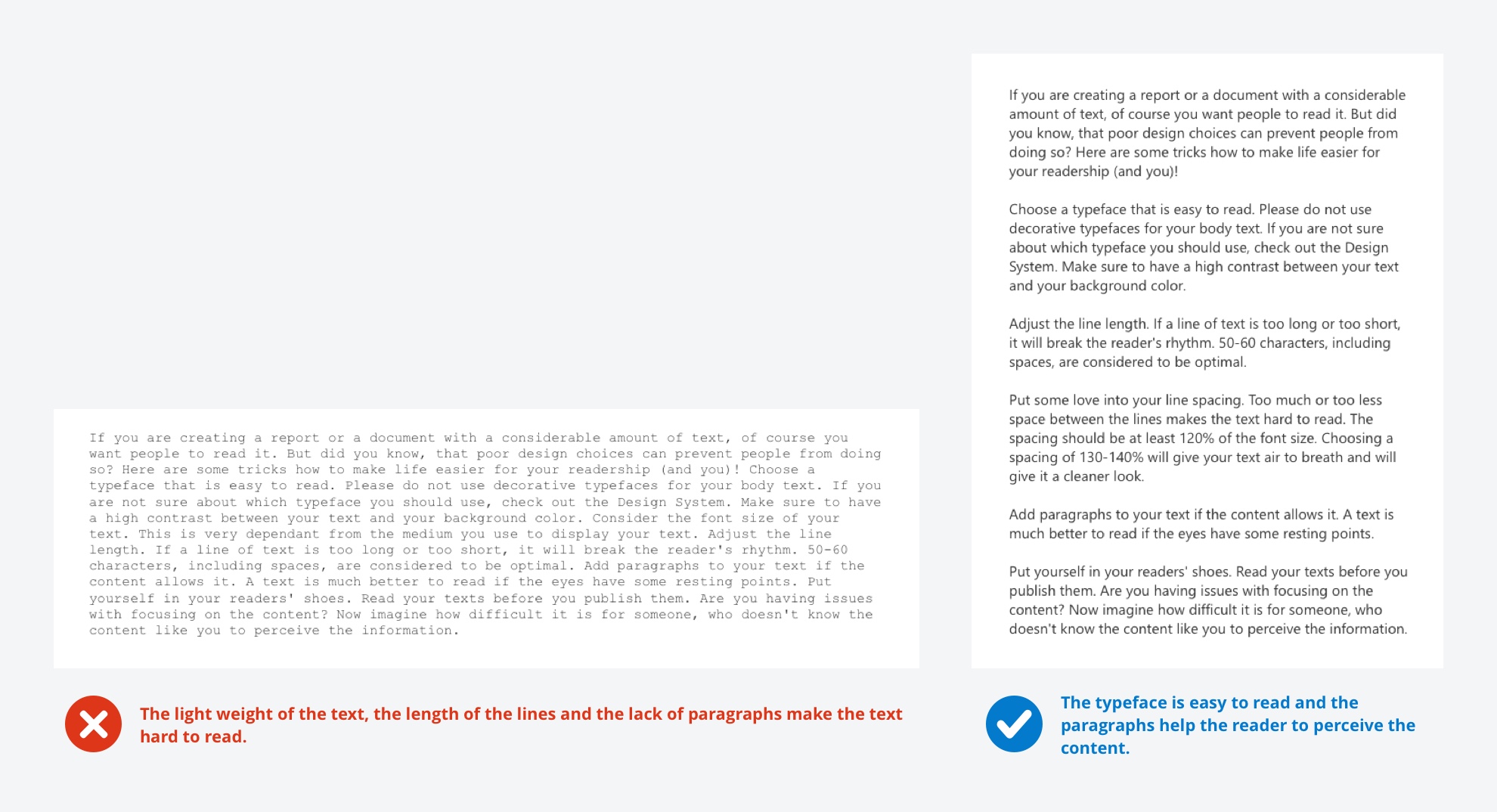
- Choose a typeface that is easy to read. Please do not use decorative typefaces for your body text.
- Make sure to have a high contrast between your text and your background color.
- Consider the font size of your text. This is very dependent from the medium you use to display your text.
- Adjust the line length. If a line of text is too long or too short, it will break the reader's rhythm. 50-60 characters, including spaces, are considered to be optimal.
- Add paragraphs to your text if the content allows it. A text is much better to read if the eyes have some resting points.
- Put yourself in your readers' shoes. Read your texts before you publish them. Are you having issues with focusing on the content? Now imagine how difficult it is for someone, who doesn't know the content like you to perceive the information.

Numbers in tables
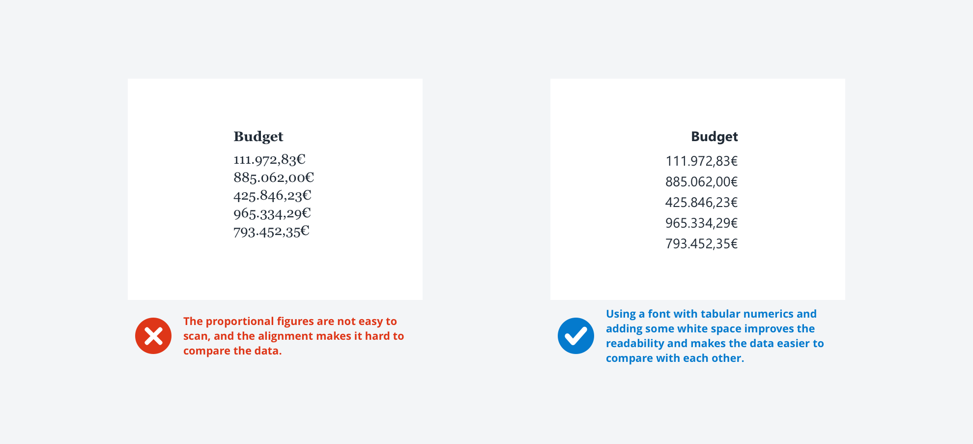
Use tabular figures
Other than proportionally spaced fonts, tabular figures are designed that each digit has the same width. This will make your numeric data look a lot more structured and therefore a lot easier to scan.
Align your content
Columns of numbers are usually right aligned. This makes it easier to perceive and compare the data. Don’t forget to align the table headers to your content.
Add white space
Don’t clutter your tables with too much information. Instead, add space to increase readability and group data logically.

- Previous
Colors -
Next
Iconography