Buttons
We use buttons, so users can trigger an action by clicking them. A button can contain text or an icon.
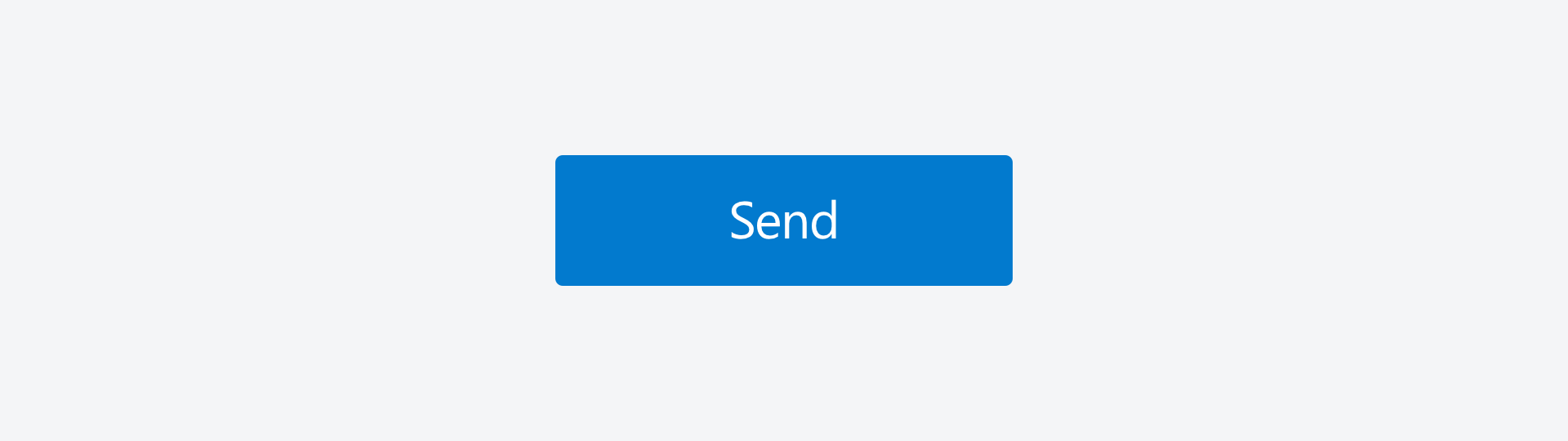
Buttons are one of the most important elements of interaction design. They communicate actions that a user can take.
When to use
- if you want your user to trigger an event.
When not to use
- If you want to simply display information.
- If you don't intend interaction.
Formatting
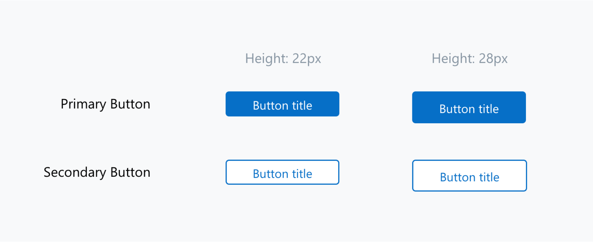
Primary and Secondary Buttons
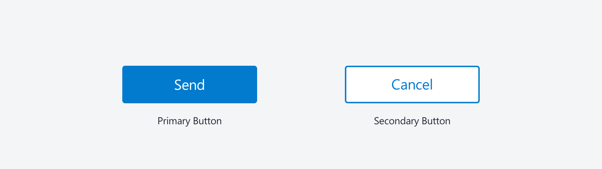
Primary Button:
- used for main action
- use only one primary button per screen
- should draw more attention to it than a secondary button
Secondary Button:
- alternative to the primary action
- there can be multiple secondary buttons in one screen
- should be less in focus than the primary button
States
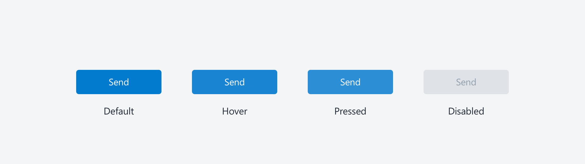
Buttons can have different states: they can be enabled or disabled. Here is some info about the states and some suggestions for styling them.
- "Default" buttons are enabled and can be clicked. (color #057ACE; text color #FFFFFF)
- If the mouse cursor hovers over the button, the "Hover" state is triggered (color #1984D2; text color #FFFFFF)
- By clicking on a button, it enters the "Pressed" state. (color #2C8ED5; text color #FFFFFF)
- "Disabled" buttons can’t be clicked, they are shown as inactive. (color #DFE3E8; text color #919EAB)
Examples
Tips for Buttons
Buttons are used to trigger actions by clicking them. Here are some tips how to use buttons more effectively:
Make them look clickable
Give your buttons a consistent look, but also make them look like you can actually click them. If your button is styled like the rest of your text elements, your user will not understand that he/she can interact with it.
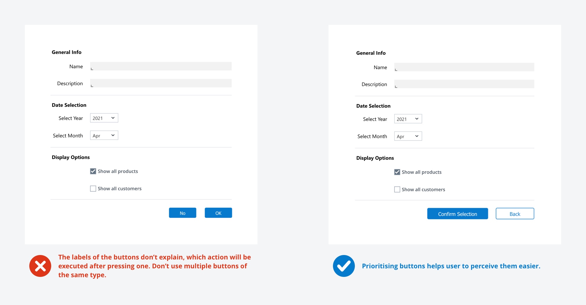
Make them consistent – but not the same
Different kind of buttons (primary, secondary, tertiary) are used to guide users through the process. Decide which button is most likely to be clicked and make it a primary button. Use a secondary button for the other option. There shouldn't be more than one primary button to choose from.
Place them logically
Buttons should be placed where users expect them to be. For example, I fill in a form with information and I have to confirm the input via a button. I expect the button to be positioned below the last input field, not on top of the form.
It's all about the wording
Be aware that your user does not know what will happen if he/she interacts with a button so the button itself has to communicate this. Try to use verbs and formulate clearly, what is about to happen. Wording like "OK" is not okay and should be avoided!
Buttons are static
Buttons in Jedox are static elements, e.g. they won't work in Dyna Ranges.
-
Previous
Stylesheet -
Next
Links