Menu
Dialog
The dialog element opens up as a modal in order to prompt the user for information or for a response. It forces a decision or a confirmation that needs sign-off from the user. It shouldn't be used for extensive data entries, use forms therefore instead.
When to use a dialog
Not sure if you should use a dialog or a form? As mentioned above, forms are suitable for extensive data entry. Consider using dialogs if the user spends little time on the report and if it requires little screen real estate.
Properties
Dialog components
Various types of UI Components can be placed in the dialog container (which is in Jedox actually built as a report):
- Label and text elements
- Text input controls, like input field and text area
- Selection controls, like checkbox, combo box, date picker, radio button, select
- Icons
- Links
Dialog attributes
- Give the dialog an adequate title and group related information.
- Order the dialog content in a logical manner from a user’s perspective.
- A label is not a help text - Assign to each field a meaningful label. Labels should be to the point, descriptive and short.
- If an input element is in an error or warning state, choose a meaningful message for the user.
- Less is more - try to minimize the number of labels and their corresponding fields to only the necessary.
- Provide interaction buttons such as “Cancel” and “Save” buttons on user input dialogs to reduce user’s uncertainty when leaving the page or entering data.
- Avoid scrollbars in dialogs (You'll need to create a frameset in Jedox and set the frame without scrollbars).
Label attributes and alignment
- All labels should have the same font attributes and should be placed uniformly (and according to the Jedox Measure System).
- Label should be aligned to the right of the value. Right-aligned labels minimize the gap between label and field so the user’s eyes can scan along one line and which avoids unnecessary eye movements. Keep in mind that label size can vary when translating them into another language.
Examples
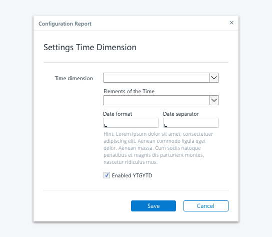
Simple dialog
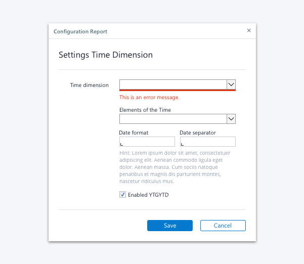
Dialog with error validation
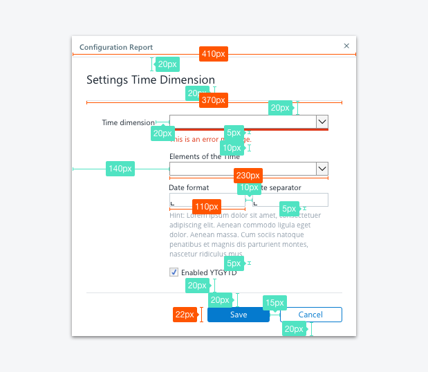
Spacing
Spacing of elements in a dialog
Spacing of elements in a dialog
Dialog Stylesheet
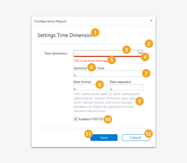
Dialog elements
Definitions Dialog Style
| No. | Element | Text | Width | Height | Background Color | Borders |
|---|---|---|---|---|---|---|
| 1 | Section Header | Segoe UI, regular, 12pt, ink (#212A36) | - | - | - | - |
| 2 | Section Separator | - | 370px | 1px | Light Gray (#F5F5F8) | - |
| 3 | Select Element - single column | Segoe UI, regular, 8pt, ink (#212A36) | 230px | 20px | - | - |
| 4 | Validation/ Error Hint | - | 230 for one-column element, 110px for two-column element | 3px | primary red (#DE3618) | - |
| 5 | Validation/ Error Message | Segoe UI, regular, 9pt, primary red (#DE3618) | - | - | - | - |
| 6 | Label top aligned | Segoe UI, regular, 8pt, ink (#212A36) | - | - | - | - |
| 7 | Input Field - single column | Segoe UI, regular, 8pt, ink (#212A36) | 230px | 20px | Light Gray (#F5F5F8), Input Indicator ink (#212A36) | - |
| 8 | Input Field - two columns | Segoe UI, regular, 8pt, ink (#212A36) | 110px | 20px | - | - |
| 9 | Description Text | Segoe UI, regular, 8pt, lightest ink (#919EAB) | 230px | depends on content | - | - |
| 10 | Checkbox | Segoe UI, regular, 8pt, ink (#212A36) | - | - | - | - |
| 11 | Primary Button | Segoe UI, regular, 9pt, white (#FFFFFF) | depends on content | 22px | normal state: primary blue (#057ACE), hover state: dark blue (#094E8A), pressed state: ink (#212A36) | Color: no color, border-width:1, border-radius:3 |
| 12 | Secondary Button | Segoe UI, regular, 9pt, primary blue (#057ACE) | depends on content | 22px | normal state: white (#FFFFFF); hover state: lightest gray (#F9FAFB), pressed state: light gray (#F5F5F8) | Color: primary blue (#057ACE), border-width:1, border-radius:3 |
See also
- Previous
Extended Header -
Next
Form