Layout
Jedox’ models & reports layouts are visually balanced. Most measurements align to the golden ratio in a kind of Fibonacci sequenced grid pattern, which aligns both spacing and the overall layout.
Layout Grid
Different layout options are possible:

Header + Content

Header + Extended + Content

Sidebar + Content

Sidebar + Extended + Content
Layout Components
Header
The header contains the title of the report, horizontal navigation elements and various buttons (menu, back to, filter, logout etc).
Extended Header Area
The extended header area can comprise filter options (PoV), navigation and further content e.g. data visualization widgets.
Sidebar Navigagtion
The sidebar navigation with its menu serves the purpose of navigation and orientation on the Jedox platform.
Measure System
The following measure system helps the user to maintain the consistency in spacing when creating reports. It´s based on the golden ratio which not only guides the user in creating and defining the elements of the report but balances the report also visually.
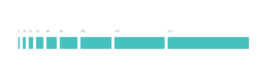
Please take this measure system as a guiding reference, not as absolute values. Sizing your UI elements should always depend on the width of the content and should then be used consistently (e.g. for the same column).
White Space
White Space is a powerful and underrated tool for layout design.
Better legibility
Adding space between elements make them easier to perceive and can make the reading process more natural.
Visual hierarchy
With white space, you can visually group elements. This has a lot of advantages. First, our brain loves patterns to perceive information as fast as possible. Having elements arranged in groups makes it much easier for a user to scan through the content quickly. This also makes you able to create a visual hierarchy which you can use to guide the user's attention.
Elegant and professional look
Adding white space gives your elements space to breathe. Your layout will look less cluttered and more elegant and clean.
So white space is no wasted space, but another design element that helps you to create structure, harmony and a great look and feel for your layout!

The art of Alignment
Alignment describes placing different elements in a way that they line up with each other. This is a very powerful tool to structure your layout and to control the focus of your user.
There are many types of alignments:
- The principle of proximity states that items close together are likely to be perceived as part of the same group. Think about which elements in your layout should be visually grouped.
- Keep your layout consistent. If you have multiple elements of the same type, align them in the same way. Also take care about a consistent spacing of your elements.
- If you want to add text, choosing the correct alignment can be crucial for a good readability. In this case, the reading direction of your language is very important.
- It's all about the context! "Centered alignment makes your text stand out!" This is very true if you are designing a presentation or cover page. On the other hand, centering every element in your form is not a good idea.

All Eyes on Contrast
Contrast is a very important design practice. It is the reason why we are able to differentiate between different elements. It can also draw a lot of attention to elements you want to emphasize and structure your layout, or simply make your design more interesting. These are approaches on how to create contrast:
Color Accessibility
When you think about contrast, the first thing that comes to your mind might be using different colors. Colors have different values (Hue, Brightness, Saturation) which you can alter to archive a better contrast. The difference between the colors you use is crucial for readability and also accessibility. If you are not sure if your colors are different enough to make them easily distinguishable, you can find online tools like contrast calculators which will help you out.
Element Size
Emphasize elements by increasing their size. A common example for this is defining a larger font size for headings than for body text. The difference in size should be very obvious to make elements stand out.
Structure with Spacing
Adding space is an effective way of grouping elements and therefore give your layout a structure. Find more tips about white space in our former post.
Variation of Shapes
Contrast is also created by different appearances of elements. This should be used sparsely because changing the shape of UI elements can also interfere with the consistency of your design and can lead to a messy and confusing look.

Display Resolution
Designing models and reports for different devices requires to consider different resolutions. We suggest to design with the following measurements in case you have no information about the users' device displays. As desktop screens are evolving continuously and Jedox models and reports have no responsive behavior, the default value is 1280px x 720px.

Mobile
Portrait: 375px x Auto
Landscape: 667px x Auto

Tablet
Portrait: 768px x Auto
Landscape: 1024px x Auto

Large
Max: 1440px x Auto
Min: 1280px x Auto

Extra large
Max: 1920px × 1080px
Min: 1280px × 720px
- Previous
Iconography -
Next
Navigation