Menu
Form
We use forms to present data to the user and to allow them to enter data in a structured way. The form also acts as a container for other UI elements (input fields, checkboxes etc) and structure them into a specific layout.
Properties
Form components
Various types of UI Components can be placed in the form container:
- Label and text elements
- Text input controls, like input field and text area
- Selection controls, like checkbox, combo box, date picker, radio button, select
- Icons
- Links
Form attributes
- Group related information and give them adequate form and group titles.
- Order the form content in a logical manner from a user’s perspective.
- A label is not a help text. Assign to each field a meaningful label. Labels should be to the point, descriptive and short.
- If an input element is in an error or warning state, choose a meaningful message for the user.
- Less is more - try to minimize the number of labels and their corresponding fields to only the necessary.
- Provide interaction buttons such as “Cancel” and “Save” buttons on user input forms to reduce user’s uncertainty when leaving the page or entering data.
Label attributes and alignment
- All labels should have the same font attributes and should be placed uniformly (and according to the Jedox Measure System).
- Labels can be placed above the field or can be right-aligned to the left of the value. Right-aligned labels minimize the gap between label and field so the user’s eyes can scan along one line and which avoids unnecessary eye movements. Keep in mind that label size can vary when translating them into another language.
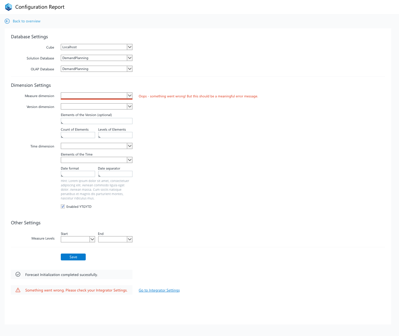
Example
Example of a form inside a report
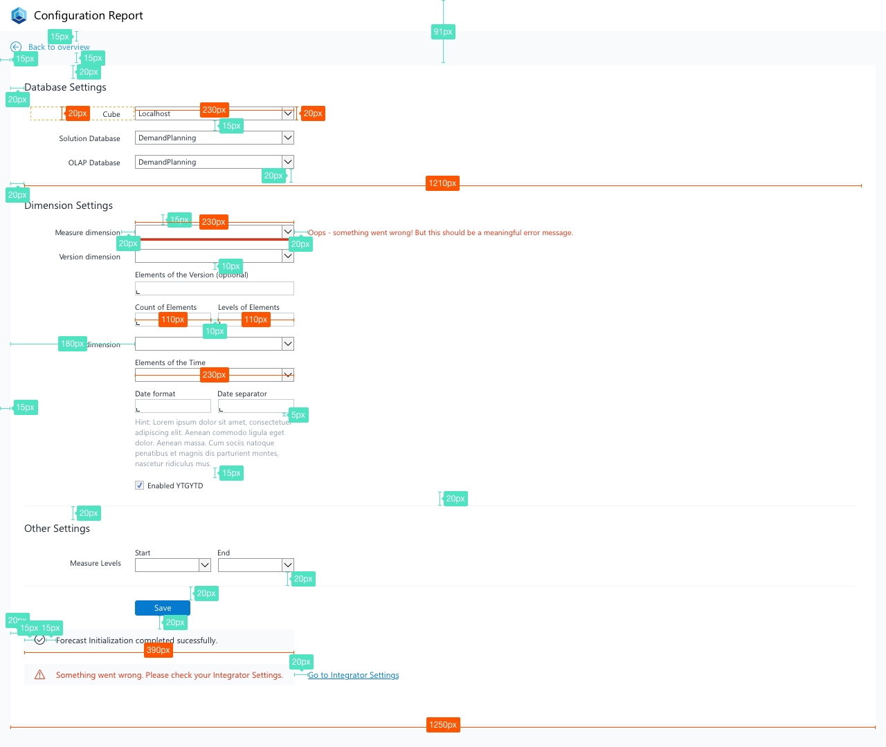
Spacing in Forms
Spacing of elements inside a form
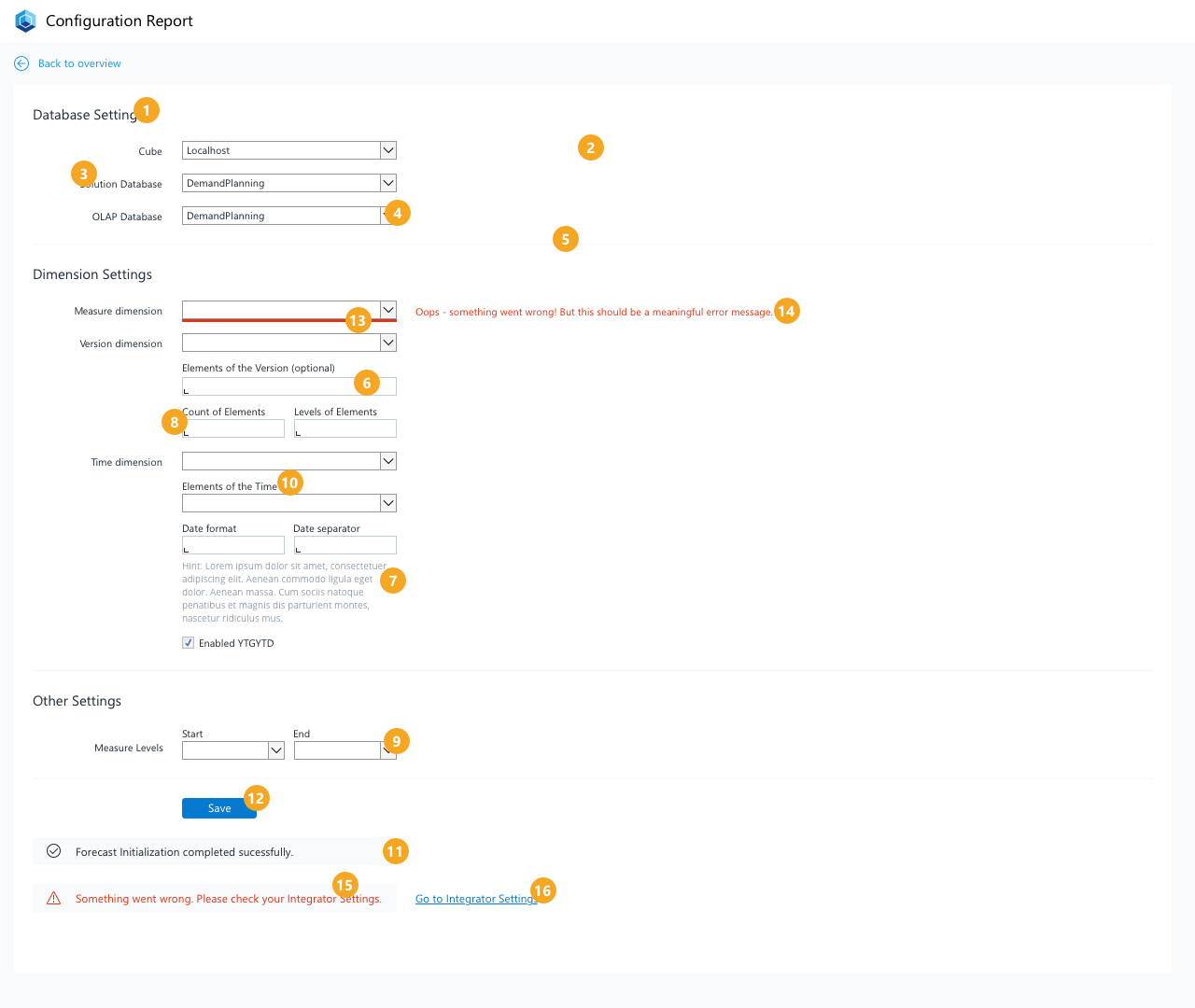
Form Stylesheet
The different elements of a form
Definitions Form Styles
| No. | Element | Text | Width | Height | Background Color | Borders |
|---|---|---|---|---|---|---|
| 1 | Section Header | Segoe UI, regular, 12pt, ink (#212A36) | - | - | - | - |
| 2 | Card Background | - | 1250px | depends on the content | White (#FFFFFF) | - |
| 3 | Label left aligned | Segoe UI, regular, 8pt, ink (#212A36) | - | - | - | - |
| 4 | Select Element - single column | Segoe UI, regular, 8pt, ink (#212A36) | 230px | 20px | - | - |
| 5 | Section Separator | - | 1200px | 1px | Light Gray (#F5F5F8) | - |
| 6 | Input Field - single column | Segoe UI, regular, 8pt, ink (#212A36) | 230px | 20px | Light Gray (#F5F5F8), Input Indicator ink (#212A36) | - |
| 7 | Description Text | Segoe UI, regular, 8pt, lightest ink (#919EAB) | 230px | depends on content | - | - |
| 8 | Input Field - two columns | Segoe UI, regular, 8pt, ink (#212A36) | 110px | 20px | - | - |
| 9 | Select Element - two columns | Segoe UI, regular, 8pt, ink (#212A36) | 110px | 20px | - | - |
| 10 | Label top aligned | Segoe UI, regular, 8pt, ink (#212A36) | - | - | - | - |
| 11 | Notification | Segoe UI, regular, 9pt, ink (#212A36) | 390px | 30px | Lightest Gray (#F9FAFB) | - |
| 12 | Button | Segoe UI, regular, 9pt, white (#FFFFFF) | depends on context | 22px | normal state: primary blue (#057ACE), hover state: dark blue (#094E8A), pressed state: ink (#212A36) | Color: no color, border-width:1, border-radius:3 |
| 13 | Input Validation/ Error Hint | - | 230 for one-column element, 110px for two-column element | 3px | primary red (#DE3618) | - |
| 14 | Input Validation/ Error Message | Segoe UI, regular, 9pt, primary red (#DE3618) | - | - | - | - |
| 15 | (General) Error Notification | Segoe UI, regular, 9pt, primary red (#DE3618) | 390px | 30px | Lightest Gray (#F9FAFB) | - |
| 16 | Error Resolution Link | Segoe UI, regular, underlined, 9pt, primary blue (#057ACE) | - | - | - | - |