Colors
Jedox uses colors to communicate how things function in the interface. This helps us create visual patterns that can make interacting with our product easier.
UI Color Palette
Color Usage
We use color to:
- Display different types and hierarchy of text (body, headings, blockquotes)
- Highlight links and actions (main CTAs, supporting CTAs, links)
- Draw attention to messages and differentiate between them (affirmation, warning)
- Separate content or create emphasis (backgrounds, borders)
- Differentiate between types of data (in charts, graphs)
The following is a set of guidelines for when and how to use each color in our palette:
Please consider these guidelines as a recommendation, your color usage can also depend on your own needs e.g. branding specifications.
Color Usage: Ink
Use ink for text and numbers on light background

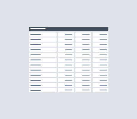
Color Usage: Gray
Use gray for backgrounds
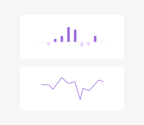
Color Usage: Purple
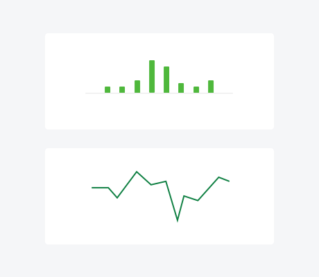
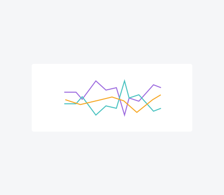
Purple is primarly used as graphing color.
Use purple for charts & Line graphs
Use purple for text links

Color Usage: Blue
Blue is used for action elements such as hyperlinks and buttons.
Use blue for text/ icon Hyperlinks
 Use blue for buttons (background color)
Use blue for checkboxes and radio buttons

Use blue as a hightlight color, eg. for titles and subtitles

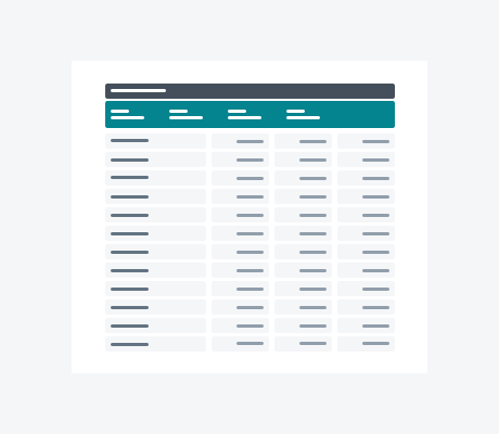
Color Usage: Aqua Green
Aqua green is used as an information color and is used in Jedox to draw attention to certain elements. It is could also be used as secondary comparision color in charts.
Use aqua green for extended table headers
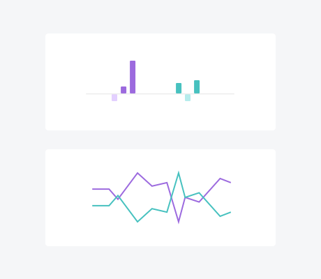
 Use aqua green as second color in a comparision chart
Color Usage: Green
Green is used to signify positivity in Jedox, but not as a color for charts (even if showing a positive trend)
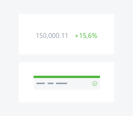
Use green for positive trends
Use green for success banners
Don´t use green for bar charts
Don’t use green for line charts
Color Usage: Yellow
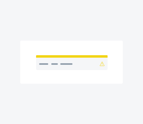
Yellow is used to draw attention to content that requires action, but is low priority.
Use yellow for attention banners
Color Usage: Orange
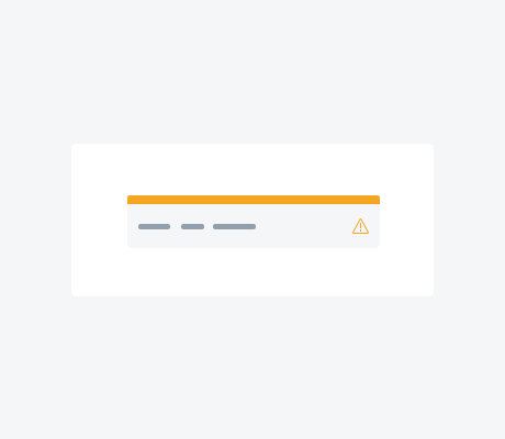
Orange is used to draw attention to content that requires action and should be attended soon. It can also be used as third color (after purple and aquagreen) for data visualization in charts.
Use orange for warning banners
 Use orange as color for graphs and data visualization together with purple and aquagreen
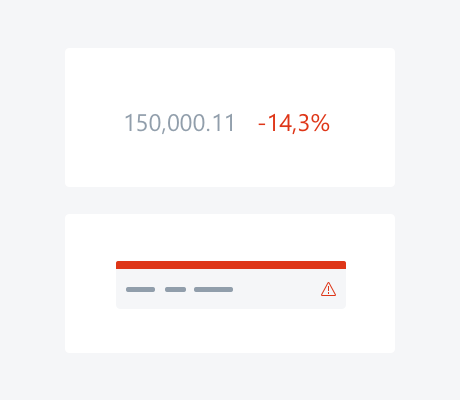
Color Usage: Red
Red is used to draw attention to elements and notifications that require critical attention. It is also used to show negative trends or destructive actions. It is a color that can produce stress, so you use it sparingly.
Use red for negative trends
Use red for critical banners
 Use red for errors in form fields
Use red for destructive buttons

Handeling Colors
Color is a very powerful tool for designing a report because it can draw a lot of attention on certain elements.
Text and Background colors need to have a high contrast
The nicest font family and size won't help you if your text color does not stand out from the background. If you are not sure about your choice of colors, you can check the contrast ratio with various online tools like Coolors.
3 Colors are enough
Overusing colors will make your report confusing. If you feel like you need more than three colors, try to increase or decrease the brightness of a color in your palette. This will add some variation to your palette but will guarantee that it will still look harmonious.
Every color has a purpose
Don't use more colors than you actually need to guarantee a clear and understandable layout. Also be consistent with coloring your elements.
Use some friendly little helpers
Creating a color palette is an interesting but also a very difficult task. But fortunately there are some very powerful Webtools that can make your life a lot easier.

- Previous
Quick Start Guide -
Next
Typography