Menu
Extended Header
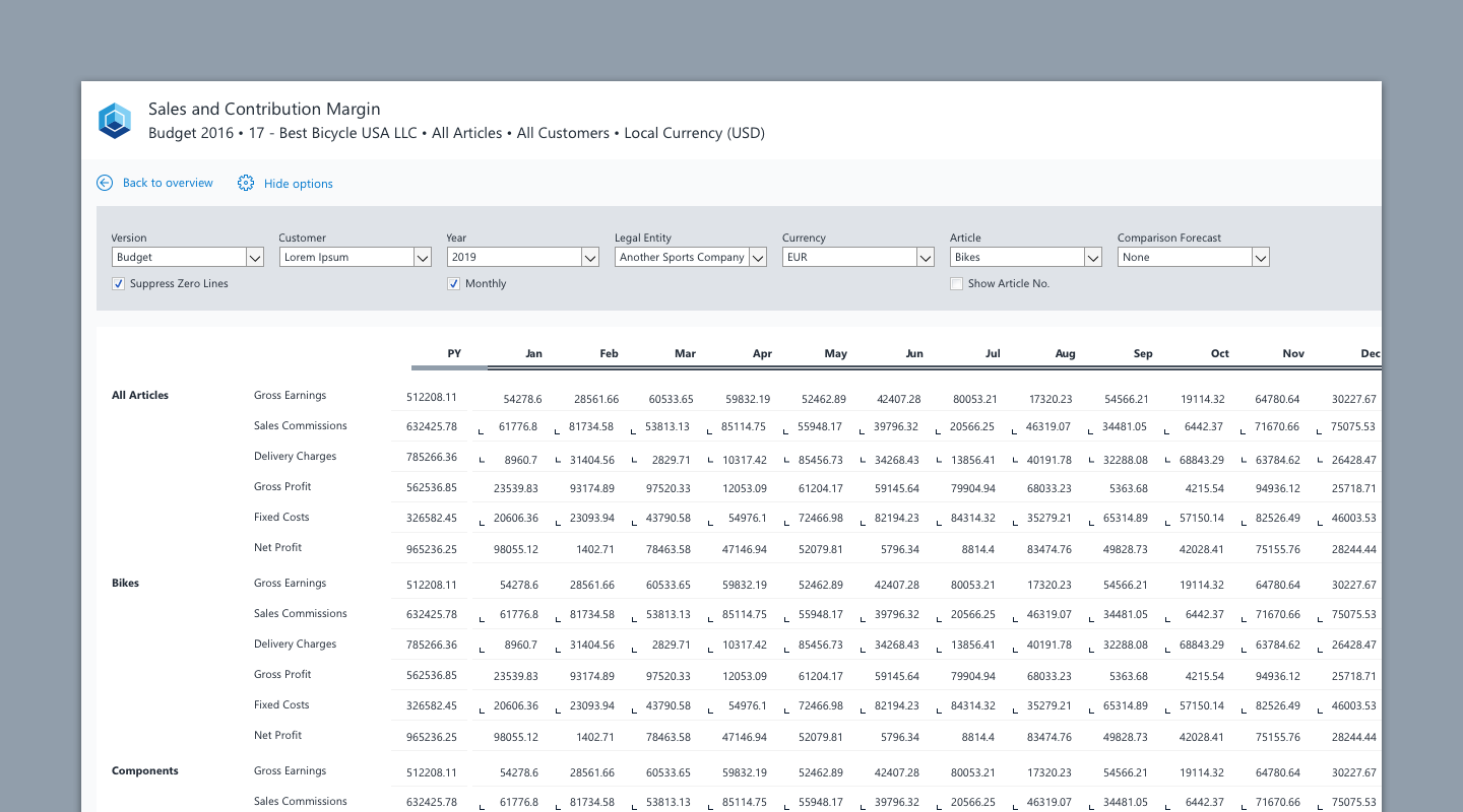
The extended header is the area between the report header and the reports’ main content and can encompass a variety of UI elements that enable the user to navigate through content, to display selected data or enhance the visualization of data.
When to use
- Data visualization elements such as Charts or Analytical Panels can be placed in the Extended Header Area.
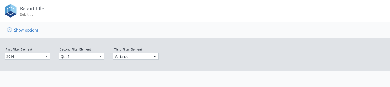
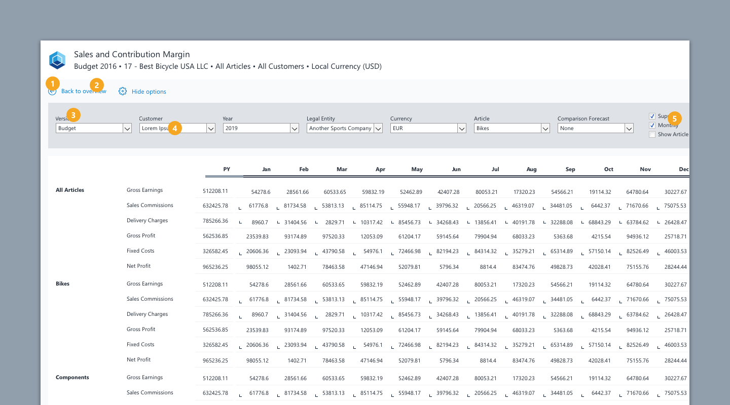
- The option section is part of the extended header area that lets the user filter and define the data that should comprise the reports content eg. filters and settings that will be applied to a table.
When not to use
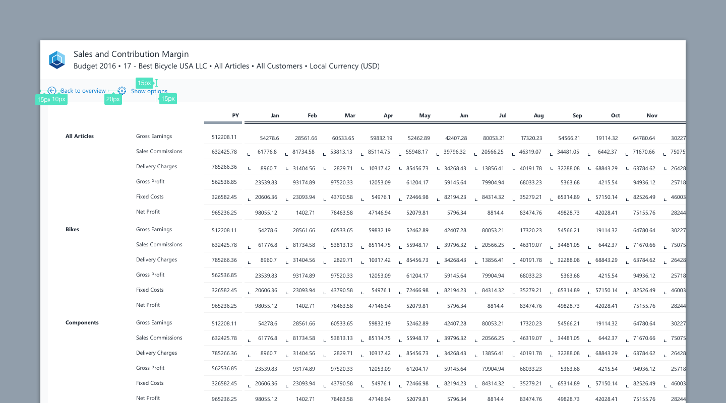
- As the set options are reflected in the Header through the subtitle we recommend to show the option selectors collapsed and expand them when the user wishes to change the options (e.g filters, zero suppression etc) .
- [Report Building Tip] Note that if you choose this modality and a vertical dynarange, you might want to put the links (expanding/collapsing link or navigational links) onto a button (instead of an hyperlink) to avoid problems with merged cells in dynaranges.
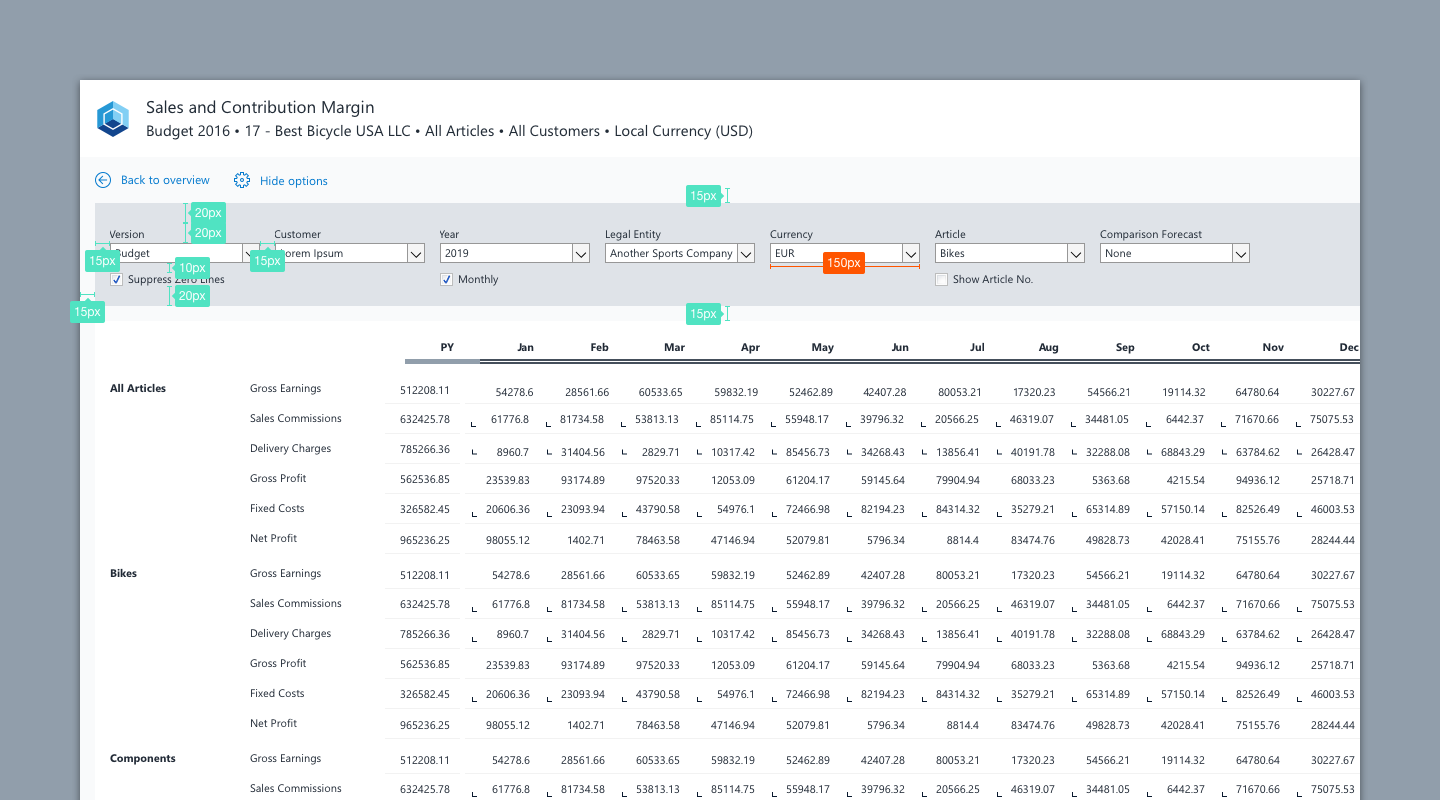
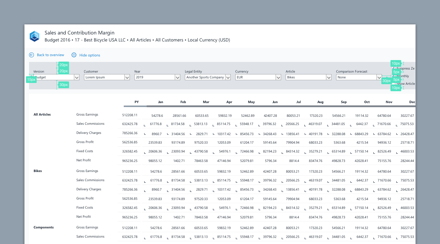
- When expanded, the option selectors are spaced equally and lie on a card that can have a different background color.
- We propose a fixed width of 150px for elements aligned in the extended header.
- If you have enough horizontal space available, consider aligning elements in one horizontal line like in the following examples:
Formatting
Stylesheet for options
| No. | Element | Text | Width | Height | Background Color | Borders |
|---|---|---|---|---|---|---|
| 1 | Navigation Icon | - | 16px | 16px | - | - |
| 2 | Navigation Label | Segoe UI, regular, 9pt, Color primary blue (#057ACE) | - | - | - | - |
| 3 | Label Select Element (top aligned to element) | Segoe UI, regular, 8pt, Color on dark background: white (#FFFFFF), Color on light background: ink (#212A36) | - | - | - | - |
| 4 | Select Element (Combo Box) | Segoe UI, regular, 8pt, Color ink (#212A36) | 150px | 20px | - | - |
| 5 | Checkbox Label | Segoe UI, regular, 8pt, Color ink (#212A36) | depends on content | 20px | - | - |
Examples
Download Extended Header (wss)