Menu
Text Input
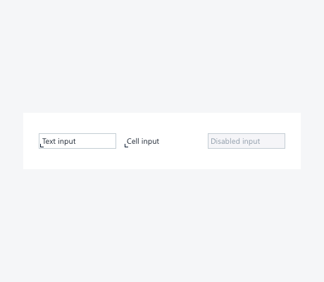
A text input component lets the user introduce text which is not longer than a single line. If the user has to enter an input that might span several lines, use the text area component instead. Nevertheless, in tables the width of the input cell depends on the width of the context.
Properties
Enabled Input Field
An enabled input field is ready to be edited by the user. By default, it has a light gray background (#F5F5F8) and a thin dark gray (#C4CDD4) border.
Disabled Input Field
A disabled input field can't be edited by the user. The light gray (#F5F5F8) background and the lightest ink (#919EAB) font color (and a thin dark gray (#C4CDD4) border) indicates the user that it can't be manipulated.
Table Cell Input
A table input cell differentiates itself from an input field as well as from a normal table cell. It's background is white (#FFFFFF) and it has a signifier placed in the left bottom corner of the cell which indicates the user that the content of the cell can be edited.
Example
Different states of input fields
See also
- Previous
Table Cell -
Next
Tooltips